
+- Hack Forums (https://hackforums.net)
+-- Forum: Tech (https://hackforums.net/forumdisplay.php?fid=444)
+--- Forum: Graphics (https://hackforums.net/forumdisplay.php?fid=156)
+---- Forum: Rate My Graphic (https://hackforums.net/forumdisplay.php?fid=133)
+---- Thread: Logo - Feedback Appreciated! (/showthread.php?tid=6140831)
Logo - Feedback Appreciated! - Otherside - Feb 19, 2021
Feedback would be appreciated - especially on color scheme as I'm yet to perfect coloring.
Also any suggestions for coloring etc?
Let me know
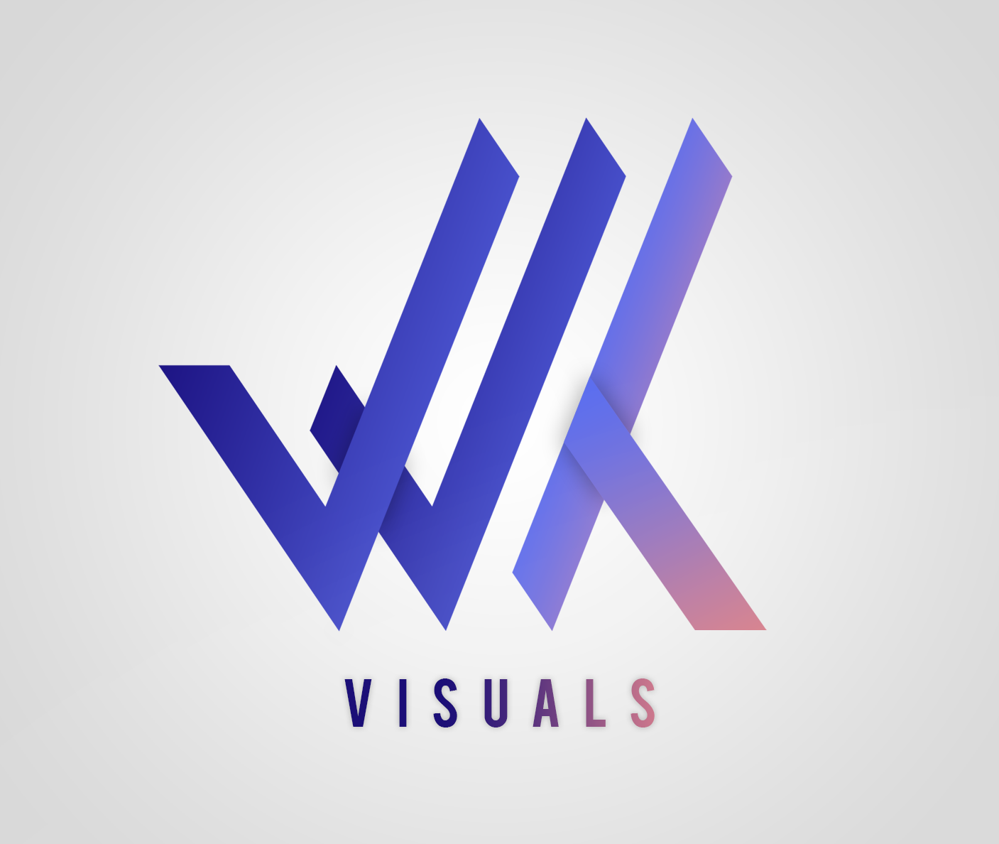
Updated version with darker colour gradient (not sure how I feel about it):

RE: Logo - Feedback Appreciated! - ingenious - Feb 20, 2021
The transition to pink shade stood out as sore thumb for me.
Just how I feel.
RE: Logo - Feedback Appreciated! - Pase - Feb 21, 2021
I love the colors, they work very well together!
Only feedback from me is VISUALS becomes hard to read towards the right, if you made it a little easier to see, would be perfect :)
RE: Logo - Feedback Appreciated! - Blogger - Feb 22, 2021
I love those colours. Very aesthetically pleasing.
RE: Logo - Feedback Appreciated! - Otherside - Feb 22, 2021
Appreciate the feedback.
I wasn't sure about the colours but I'm glad you like.
Could anyone recommend any learning/tutorials for colour work in graphics?
RE: Logo - Feedback Appreciated! - HowdyNeighbor - Feb 25, 2021
Badass, I like it. The blue to pink does stand out a bit tho, Could be a good or bad thing. Depending on how what you're going for.
RE: Logo - Feedback Appreciated! - grainy - Feb 26, 2021
As the first comment stated you should blend in the pink a bit more as it just appears in the corner all of a sudden. Other than that it looks very aesthetically pleasing, nice job!
RE: Logo - Feedback Appreciated! - HOMODIN - Feb 26, 2021
I do like the style and the colors, even tho the transition to the pink color could be a bit darker, that would add more contrast to it all. Then when you combine that with a clean and simple page/site...it just works and it's close to perfect.
Great work op! :)
RE: Logo - Feedback Appreciated! - Ninja™ - Feb 26, 2021
Colors are looking great. Overall, nicely done.
RE: Logo - Feedback Appreciated! - Otherside - Feb 26, 2021
Thanks all - appreciate the feedback. Will try changing the pink to a darker pink and post an update shortly.
RE: Logo - Feedback Appreciated! - meme - Apr 8, 2021
this is actually pretty good and colors looking great