Hey everyone, I'm here again to hear some of your feedback about my work.
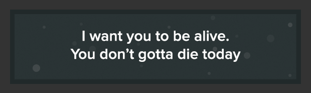
If you still don't know, I am hosting a free graphic service for almost 1 month. So here's my design for my service.
has a nice pastel, flat color scheme, nice and professional font. i have nothing negative to say
(Feb 10, 2018 10:31 PM)tearsofdeath Wrote: has a nice pastel, flat color scheme, nice and professional font. i have nothing negative to say
Thanks for the nice feedback. Still hoping some negative so I can improve my work more. ✌
DO NOT DEAL WITH THIS MEMBER
Very basic, clean, simplistic! Love it. Keep up the good work! :D
type is fuckin huge
a lot of grammatical errors and irregularities
(Feb 15, 2018 06:57 PM)prada ⠀ Wrote: type is fuckin huge
a lot of grammatical errors and irregularities
What is type? For my errors, I am willing to be corrected as I'm not good at English. :(
DO NOT DEAL WITH THIS MEMBER
Feb 15, 2018 11:55 PM
(This post was last modified: Feb 16, 2018 12:40 AM by Billie Joe Armstrong.)
Where's the image, mate-o?
Is it just me or?
(Feb 15, 2018 11:55 PM)Billie Joe Armstrong Wrote: Where's the picture, mate-o?
Is it just me or?
What picture?
DO NOT DEAL WITH THIS MEMBER
(Feb 15, 2018 11:58 PM)Vyxn Wrote: What picture?
The design.
The link seems broken for me though.
(Feb 16, 2018 12:19 AM)Billie Joe Armstrong Wrote: The design.
The link seems broken for me though.
It's fine for me sir.
Here's the link: https://#/aRAXiP.png
DO NOT DEAL WITH THIS MEMBER
Feb 16, 2018 12:38 AM
(This post was last modified: Feb 16, 2018 12:40 AM by Billie Joe Armstrong.)
(Feb 16, 2018 12:37 AM)Vyxn Wrote: It's fine for me sir.
Here's the link: https://#/aRAXiP.png
i can't connect to it.
oh well.
(Feb 15, 2018 11:40 PM)Vyxn Wrote: What is type? For my errors, I am willing to be corrected as I'm not good at English. :(
type is the text
the scale of this hierarchy is for giants
(Feb 16, 2018 10:47 AM)prada ⠀ Wrote: type is the text
the scale of this hierarchy is for giants
I see. Thanks for the feedback. I'll try to make it smaller next time. ✌
It looks clean, but its to big for the eye. Its to much, try to make the font size and boxes smaller. :)
(Feb 17, 2018 09:40 AM)Changement Wrote: It looks clean, but its to big for the eye. Its to much, try to make the font size and boxes smaller. :)
Thank you so much for your input. I really appreciated it and I'll do it less bigger next time.
:D
|