DO NOT DEAL WITH THIS MEMBER
Aug 31, 2018 04:31 PM
(This post was last modified: Sep 6, 2018 06:05 AM by Mister Slyther.)
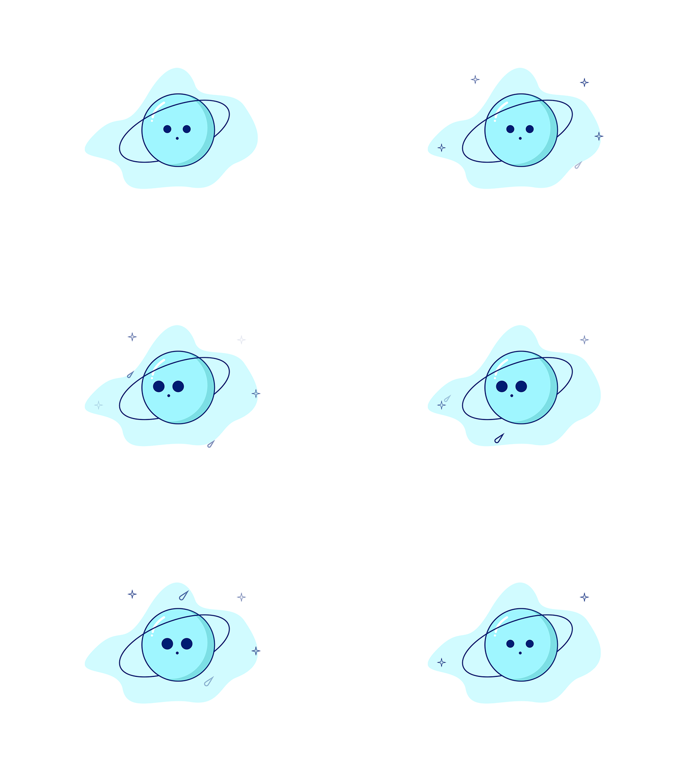
This is a small animated illustration that I made.
Done with Adobe Illustrator & Aftereffects. This could be treated as a feature icon, website art, and used on an app design.
Dribbble Shot: https://dribbble.com/shots/5084060-Blue-Planet
Updated:

Really nice, simplistic but pleasing to look at.
That's nice! I could watch that as I load a movie or login into a website.
___ı̴̴̡̡̡ ̡͌l̡̡̡ ̡͌l̡*̡̡ ̴̡ı̴̴̡ ̡̡͡|̲̲̲͡͡͡ ̲▫̲͡ ̲̲̲͡͡π̲̲͡͡ ̲̲͡▫̲̲͡͡ ̲|̡̡̡ ̡ ̴̡ı̴̡̡ ̡͌l̡̡̡̡.___
I really like that, it looks allot like a loading symbol haha
DO NOT DEAL WITH THIS MEMBER
This would make for an awesome 404 error page. Really like your color choices, and the animations are really smooth. I'd like it more if the eyes looked in the opposite direction as well. Maybe have an asteroid or two flow behind the planet? Smaller and bigger stars to create a sense of depth.
I really like it, although the changing eye size feels kind of off. Great colour choice though and really smooth animations.
It´s simple and cute, but that´s all :D
Really like it tbh, quite simple but looks clean
Sep 4, 2018 12:16 PM
(This post was last modified: Sep 4, 2018 12:17 PM by DotDanger.)
(Sep 3, 2018 04:14 PM)Two-Ton 21 Wrote: This would make for an awesome 404 error page. Really like your color choices, and the animations are really smooth. I'd like it more if the eyes looked in the opposite direction as well. Maybe have an asteroid or two flow behind the planet? Smaller and bigger stars to create a sense of depth.
This guy has the idea.
I like the design but the white background may need adjustment as well. Too bright at least from what i see. 9/10 ✌ love it
DO NOT DEAL WITH THIS MEMBER
simplistic but good! What program did you use to make this?
DO NOT DEAL WITH THIS MEMBER
Sep 4, 2018 12:51 PM
(This post was last modified: Sep 4, 2018 12:51 PM by Mister Slyther.)
(Sep 3, 2018 04:14 PM)Two-Ton 21 Wrote: This would make for an awesome 404 error page. Really like your color choices, and the animations are really smooth. I'd like it more if the eyes looked in the opposite direction as well. Maybe have an asteroid or two flow behind the planet? Smaller and bigger stars to create a sense of depth.
Thanks and yes I agree with you.
Also to everyone else, i appreciate the compliments.
(Sep 4, 2018 12:19 PM)Who Soup Wrote: simplistic but good! What program did you use to make this?
Thanks bud, read the OP haha
Oh damn, if you made that it's fucking amazing 10/10 great work.
Please make it so that the eyes look in the other direction as well. This triggers my OCD. :(
But other than that, both your choice of colors and the animation are fine af. Good work.
my only suggestion is turn that little comets to white since it looks like water droplets .
anyway good job mate .
(Sep 3, 2018 04:14 PM)Two-Ton 21 Wrote: This would make for an awesome 404 error page. Really like your color choices, and the animations are really smooth. I'd like it more if the eyes looked in the opposite direction as well. Maybe have an asteroid or two flow behind the planet? Smaller and bigger stars to create a sense of depth.
Agree with this statement.
|