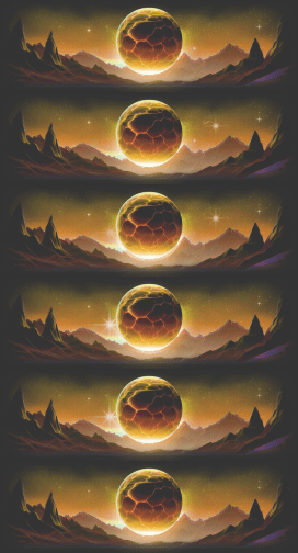
Hey guys its Owenhackz back with some good graphic of hemp inspired trippy logo for a YouTube account in future maybe anyway simply rate out of 100 much bigger scale this time to choose from thanks for your support and comment if you choose to that is...

6 out of 10 keep going though. Theres plenty of room for improvement. Bless up
Apr 13, 2019 06:40 PM
(This post was last modified: Apr 13, 2019 06:41 PM by Desy.)
None of the graphics/fonts go together very nicely 2/10
were you high when making this?
I don't like the hemp green color too bright, the only thing I like about this is the leaf connecting to oil
(May 30, 2022 07:51 AM)Focus Broken Wrote: It's memorial day, remember to spit on a soldier's grave.
This is so bad it must be a parody
(Apr 14, 2019 02:51 AM)Herbert Wrote: were you high when making this?
If he was then it woul be a shit load better.
OP, it looks a little MS Paint.
(Apr 14, 2019 02:51 AM)Herbert Wrote: were you high when making this? Definitely was.
There's like 100 things going on in it.
DO NOT DEAL WITH THIS MEMBER
Sometimes your favorite things cant all go together.
It looks pretty bad tbh, but if you're learning then it's fine to mess with all the different tools and effects. Like why is there a lens flare on the leaf? Your background takes up too much focus, and your focus is tacky looking. The logo thingy in the middle probably shouldn't look like it's being covered in shadows, but maybe you were going for a 3d effect. It'd also look better If you took out the detailed leaf and put in a silhouette version of it, but at the very least take off the lens flare lol. Which brings me to the next thing to work on which is your lighting. it comes from the left on your big logo and then it comes from the right on your leaf. Keep the lighting universal (for the most part) or else it looks way off.
That's all I can really think of. but as it is, I wouldn't use it if you paid me. 5/100 for the lens flare. But don't let my hard critique keep you from doing graphics, everyone's stuff looks like this at some point. :)
It’s not really a logo mate.
I mean that background just takes the L for me bro, It just is too colourfull. If you just had the logo with a little bit of shading maybe then it would be a lot better standalone.
|