

This is the first test conception of it. Rate it from 1 to 10. Thanks.

Dark minimalistic concept [Thread Design] |

Can I get any credit for the semi-Latin content containing my username in it? Joking my man.
I like the dark colour, but I'd make the font color a little bit more bright or sharpen it. It looks a bit blurry / unclear from my PC. Not sure if others see the thread the same as I do. 
It's way too basic. Simple can be nice, but it still have to have some special element in it.
Your design is basic and could probably be done by someone with no prior experience. Sorry, not trying to get you down but am being honest. Try to add some more elements, or a twist that makes it your own. (Feb 28, 2020 04:53 AM)Deal Wrote: It's way too basic. Simple can be nice, but it still have to have some special element in it. Thank you for your opinion ✌, as I told in my post this is a test concept that I started recently. It's not the final version. I will update the topic when I improve it. 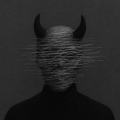
Feb 28, 2020 04:56 AM
(This post was last modified: Feb 28, 2020 04:57 AM by Linux X.)
(Feb 28, 2020 04:53 AM)LoremIpsum Wrote: Can I get any credit for the semi-Latin content containing my username in it? Joking my man. Yep, you got the point. I may make some changes with the fonts. Thank you for the suggestion. (Feb 28, 2020 04:56 AM)Cyam Wrote: Honest opinion? So thank you for the honest opinion ✌. I will upload v2 soon. (Feb 28, 2020 04:53 AM)Deal Wrote: It's way too basic. Simple can be nice, but it still have to have some special element in it.Exactly. Feedback like this will only help an artist, I think. (Feb 28, 2020 04:56 AM)Linux X Wrote: Yep, you got the point. I may make some changes with the fonts. Thank you for the suggestion.No problem my man, looking forward for your next update of art.  
Well besides the fact it's just a text with a watermark on black background,
I think that you should either change the font or make it right, looks kinda stretched/wide. Not sure if the font is like that or you made it stretched, try using shift+click when you are expanding the selection of objects or even text, It will keep it's original look and will expand the size equally & properly, whether you make it bigger or smaller just hold shift and you have no more worries about that problem. Other than that I will not comment on your thread as I think you can do much better than just placing text on black with some default objects. If you are not sure how just look up some tutorials or ask people around here, than once you actually have some work done upload more of your work, than we'll be able to actually tell you what we think about it & give you tips on how to improve if you wish to do so. :) 
Too basic for me.
If your intention is to make it simple, try to play more with the typography and size
>>>> High quality domain names <<<<
|
|
|
| Possibly Related Threads... | |||
| Thread / Author | Replies | Views | Last Post |
| by uTripAug 16, 2022 09:39 AM | 1 | 145 |
Aug 16, 2022 09:39 AM Last Post: Blight |
| by NetApr 8, 2022 04:24 AM | 6 | 186 |
Apr 8, 2022 04:24 AM Last Post: Net |
| by G-DINIJan 17, 2021 05:27 AM | 0 | 113 |
Jan 17, 2021 05:27 AM Last Post: G-DINI |


